Accessibility
Accessibility guidelines ensure that people can perceive, understand, navigate, and interact with websites and digital tools no matter their auditory, cognitive, neurological, physical, speaking, or visual abilities. Taking accessibility into account removes barriers for people with disabilities and can make web interfaces and information more enjoyable for everyone. The following accessibility guidelines can also improve the usability of print products.
This guide briefly introduces best practices for making digital and print content accessible. It is not meant to be an in-depth manual, but it can provide a basic foundation that serves as a starting point for deeper research or conversations with developers. Some recommendations may be difficult to implement without specialized devices or expertise; if that’s the case, assess whether the content warrants contacting accessibility professionals or consulting with end users with disabilities. The guide is organized according to the phase of the project, with considerations that are most relevant for each phase.
For more information on accessibility, see the Web Content Accessibility Guidelines, a set of guidelines recognized globally as the standard for web accessibility, and other resources listed in “Resources on accessibility.”
New Work
Background:
Designing content with accessibility in mind from the beginning is much easier and less expensive than trying to retrofit existing media to be accessible. For example, it’s easier to incorporate markup languages or Accessible Rich Internet Applications (ARIA) labels into a website when it’s being built than to add them after. Similarly, it’s easier to create a video script with integrated descriptions than to try to add those descriptions after recording. See also “Markup languages and ARIA attributes” and “Videos.”
Recommendation:
When producing or designing a new piece of print or digital content, begin with inclusive design processes and take accessibility into account from the very beginning. Often, coders and designers who have a disability or have experience making content accessible are best placed to apply the accessibility guidelines.
Assistive devices and technologies
Background:
There are many devices and technologies that help people access information. The type of device or technology someone uses depends on what kind of disability they have and what kinds of media they are processing.
For example, a common digital technology for people who are blind or have low vision is a screen reader, which reads text from computer programs, messages, web pages, emails, books, and more out loud or sends the information to a braille display. A braille display is a device that uses tiny pins that are raised and lowered to form braille characters that can change as the user reads using their fingertips or as the text on the page changes. There are also devices that print braille on paper for offline reading.
Other common technologies are speech-to-text software, which renders spoken words into text, and voice-control software, which allows users to vocally issue commands to a device. People who cannot use a keyboard or mouse may use software or hardware that uses eye control or a laser pointer to control. Screen magnifiers can help people with limited vision. Some keyboards are configured to have extra-large keys or to be more comfortable for people using only one hand.
Recommendation:
When developing content, be aware of the different devices and technologies people use to navigate digital and print information. Consider testing accessibility by navigating with different kinds of assistive technologies and when possible, ensure that people with disabilities or people experienced with using the technologies can help with testing. See also “Keyboard accessibility.”
Writing for accessibility
Background:
Clear writing can help everyone understand information more easily. Plain language is a specific method of writing that uses clear and simple wording. It can make texts more accessible to people with cognitive disabilities and people who speak English as a second language.
Plain language:
• uses simple sentence structures,
• uses active voice (a sentence structure in which the subject does the action),
• puts the most important information first,
• defines difficult but important terms,
• defines abbreviations before using them,
• avoids idioms and jargon,
• uses familiar words, and
• uses bullet points instead of long in-line lists.
Plain language isn’t always the best option. Fiction or creative pieces of writing are not good candidates for translation into plain language, but informational material or content intended for a broad audience are. When a piece of content is translated into plain language, it’s typical to make both plain and nonplain versions available. Make sure the tone always respects the reader.
Incorporating some of the principles of plain language in scholarly and peer-reviewed journals and technical writing, particularly abstracts, could make science and science findings more accessible to a broader audience. Providing plain language summaries to scholarly articles has become increasingly common. For example, the Cleveland Journal of Medicine was able to increase its readership after switching its style to include some aspects of plain language.
Recommendation:
Use plain language when the information is particularly relevant for readers with cognitive disabilities or readers who could benefit from simple presentation. In technical writing and scholarly scientific work, adopt principles of plain language to make findings more accessible. Write in clear, direct sentences with the most important information in the beginning. Use short sentences and familiar words. Use active voice, in which the subject of the sentence performs an action.
Example:
Use:
Example Summary
“The Tehuantepec earthquake generated a tsunami that, while modest in size, lasted a very long time. Specialized instruments, called tide gauges, measure the sea-level and registered tsunami waves for as long as 3 days in the region. In order to understand why the tsunami lasted so long, we model it using specialized computer code and analyze the results of the model. We find that the long duration is most likely due to where the tsunami happened. It occurred inside of a very flat and shallow part of the ocean called the Tehuantepec shelf. Because of its shape, the Tehuantepec shelf traps tsunami waves and these slosh around the region for a very long time. This trapping effect had not been identified in the region before, and it is important to understand because future earthquakes in the region might generate much larger tsunamis which will have the added hazard of also lasting a very long time. Future tsunami planning efforts should take these results into account.”
Example Abstract
“The 8 September 2017 M8.2 Tehuantepec, Mexico, earthquake ruptured an ~150-km-long high-angle normal fault below the subduction zone megathrust. A tsunami was generated by the event with surveyed runup as large as 3 m. Tide gauges in the region show a remarkably long duration of the tsunami with oscillations within the very wide and shallow Tehuantepec shelf lasting as long as 3 days. Here we produce a model of the tsunami and validate it by comparing it to the tsunami survey and to the time and frequency domain features of regional tide gauges. We analyze the model results and show that the long-lived oscillations are a result of wholesale resonance of the shelf as well as very efficient trapping of edge waves at the shore. These resonant features are the result of the Tehuantepec shelf morphology and illuminate a previously unidentified tsunami hazard for the region.”
Credit: American Geophysical Union, 2023. Creating a Plain Language Summary
Fonts and typefaces
Background:
Overly ornate or obscure typefaces can make it difficult for people with dyslexia and other cognitive disabilities to read text. Commonly available ones, including Arial and Helvetica, help avoid barriers to presentation across browsers and in print. Fonts describe the different ways typefaces are stylized, including their size and whether they are italicized or made bold. Typefaces can use serifs, a small line or stroke added at the end of a larger stroke. Sans (meaning without) serif is a typeface that does not have those additional strokes. Both fonts and whether a typeface is serif or sans serif can also affect accessibility. Likewise, including too many different kinds of fonts or typefaces in the same document or site can affect accessibility.
Among accessibility experts, there is some disagreement about whether it’s important to avoid serif fonts. In general, sans serif typefaces, such as Helvetica, can be clearer if ornamentation is distracting, but some people have difficulty differentiating sans serif characters such as “p,” “q,” lowercase “L” and uppercase “i,” or “b,” and “d.” In general, best practice is to choose a common typeface in large font, depending on context.
Recommendation:
Use common typefaces and ensure there is an adequate but not an overexaggerated amount of spacing between letters and words. Avoid stylizing extensively with caps lock, shadows, or text overlaid on other text. Avoid large sections of italicized text. Avoid using many different types of fonts and typefaces in one document.
Font size for email or word processing documents should use at least 12 point or larger for normal text. Slide presentations should use at least 24 point or larger for body text and 28-48 point for titles. Poster presentations should use 24-30 point for body text, 36-60 point for headings and subheadings, and 45 – 120 point font for title, depending on length.
Hyperlinks
Background:
Some people may read pages in a way that presents the link text separated from its context. This means that link text such as “click here” is not very helpful. Link text that describes the link function or destination content can help users understand the purpose of a link from the text alone. Very long link text, as in a long URL, can be cumbersome for people using screen readers, while very short links may be difficult for some users to select.
Recommendation:
Link descriptive words that tell people where the link will go instead of ambiguous language, such as “click here” or “read more.” Avoid linking long sentences. Also avoid very small links, such as a single text character. Long URLs are best presented as linked words rather than printing and linking the URL. When it’s not possible for link text to describe where the link goes, you can use code to provide a description that screen readers can access, such as with ARIA attributes or hidden text. See “Markup languages and Accessible Rich Internet Applications (ARIA) attributes.” In this case, the words that are linked might be generic, but people using screen readers will get more context for where the link goes. For more information, see Web Accessibility in Mind’s tips on links and hypertext.
Example:
Use:
Read more on when and how to mention gender and sexual orientation.
Avoid:
For more information on when and how to mention gender and sexual orientation, click here.
Alternative text and image descriptions
Background:
Alternative text, or alt text, is a digital element embedded in visuals. It appears when an image doesn’t load and is read by screen readers, so it is essential for helping people with low or no vision interpret any nontext element, including photos, tables, graphs, and graphics. The alt text should describe what the image shows without repeating the caption, as a screen reader will also read that. Most guides recommend being as concise as possible, as overly long alt text may burden users; guidelines range from 100 to 150 characters. While there is no hard limit, longer descriptions can be embedded using different methods. For longer descriptions and more complex images, such as text or graphics, see “Infographics.”
Not everyone with a disability uses a screen reader. While alt text isn’t usually visible, image descriptions accompany images visibly, often next to or underneath a caption in addition to alt text. They are used most widely on social media. Image descriptions are longer, more detailed descriptions of images and can encompass more context and tone. If an image description doesn’t fit with the caption, it’s also acceptable to add it in the comment section of a social media post.
There is some disagreement about how specific alt text should be in describing the race, gender or other characteristics of people portrayed in an image. Some advocates argue that it’s best to include race, for example, because omitting the information reinforces a false, socially-constructed narrative that the default is white. But others say that writing descriptions of such characteristics runs the risk of misidentifying the person or people portrayed in the image.
Recommendation:
Provide clear, concise alternative text for images and other nontext features wherever they appear online, including on social media. When using a logo, it is not necessary to describe the details of the image, but the logo should be identified, such as “Acme logo.” Images that are truly decorative, such as spacers, or invisible images that are simply for formatting a page do not need a description and should be marked as decorative so that readers do not find clutter on the page. When writing alt text for an image of people, mention the characteristics that are useful for readers to understand the meaning of the image, and make an informed choice about what other characteristics to include. When you need longer alt text, use a different strategy, such as providing a text summary underneath a graphic (see “Infographics”). On social media, you may add more detailed image descriptions in the posts accompanying images.
Examples:
Use:

The alt text for this image describes what it looks like, while the caption provides editorial comment (C&EN, Sept. 9, 2018).
Alt text: "A glass toilet with an atomizer attached to the top, making it look like a sprayable perfume bottle."
Caption: "Eau de toilet: Liquid Assets' smelly spray has more refined uses than you may think."
Use:

The alt text for this drawing describes what it looks like, including IUPAC naming for chemical structures (ACS Central Science 2023 9 (9), 1712-1714, DOI:10.1021/acscentsci.3c01101).
Alt text: "Above, Bryan Shaw looks pensively upon a plastic 3D-printed card that he’s holding in his outstretched arm. It shows the chemical line structure for (2E,4E)-deca-2,4-dienoic acid and its ethyl ester as well as ethanol. The line structures are printed as raised ridges on a translucent plastic card. Below, he holds a similar plastic card that shows an image 10-lane electrophoresis gel with the bands represented by tiny raised blobs that appear darker on the card.”
Caption: “Bryan Shaw of Baylor University holds textured 3D-printed tactile graphics of a chemical structure (top) and an electrophoresis gel (bottom). Lifted ridges on the cards allow scientists and students to read information and data without having to see the graphics. Minkara collaborated with Shaw’s group on the work.”
Use:

The alt text for this drawing describes what it looks like, while the caption provides editorial comment (C&EN, Aug. 7, 2023).
Alt text: "A protein structure diagram, with a small molecule docked inside the binding pocket.”
Caption: “A crystal structure of the new antibody shows how fentanyl fits into its binding pocket.”
Images of text
Background:
Image of text cause barriers for many people. When text is portrayed by an image, screen readers cannot access and read the text. Therefore, people who use screen readers will not have access to the text in the image. It is also not possible to meaningfully magnify text in an image. People who use browser zoom features will find that the text in the image does not wrap or zoom.
Recommendation:
Choose text, an HTML data table, or MathML (or the other languages supported by the platform) for text, formulas, and equations. Do not use images of these elements. For example, if you cannot select the text in a table, the table is likely an image and will not be accessible to all readers.
Examples:
Use:
The "Barium Acetate" monograph in ACS Reagent Chemicals has an HTML data table, which is more accessible than a table rendered as an image. An abbreviated version of the table is shown here.
| Element | Wavelength (nm) | Sample Wt (g) | Standard Added (mg) |
|---|---|---|---|
Ca | 422.7 | 0.04 | 0.02; 0.04 |
K | 766.5 | 1.0 | 0.02; 0.04 |
Na | 589.0 | 0.10 | 0.005; 0.01 |
Sr | 460.7 | 0.05 | 0.05; 0.10 |
This is an HTML data table, which is more accessible than a table rendered as an image.
Avoid:
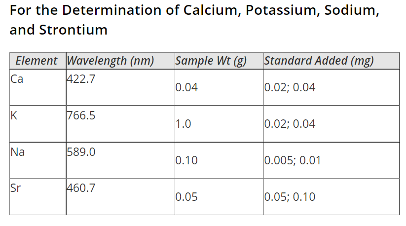
This screenshot of part of the table shows the table as an image, which is less accessible.
Use:
The "Barium Acetate" monograph in ACS Reagent Chemicals also uses MathML for the assay of barium, rather than an image of the equation.
Avoid:
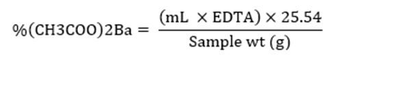
The screenshot shows an image of the equation, which is less accessible.
Formatting tables
Background:
Data tables can often be the best way to depict data to people who use screen readers, but when the tables aren’t correctly formatted or structured, the table can present a barrier. If the header cells and data cells of a data sheet are labeled using a markup language, which formats digital texts with code, then screen readers will be able to contextualize the data being presented. Screen readers often have difficulty parsing split or merged cells, and nested tables make information difficult to access.
Recommendation:
When presenting a table, use markup language to label column and row headers, as screen readers use this information to contextualize the data in the table. Avoid split or merged cells, and keep the number of columns in the table consistent throughout. Don’t use nested tables. See also “Markup languages and Accessible Rich Internet Applications (ARIA) attributes.”
Color to convey meaning
Background:
For people with color vision deficiency (also called color blindness) and people with low vision, differentiating between certain colors and shades can be difficult, if not impossible. If information is conveyed by color alone, some people may not be able to access the information. Additional ways of conveying information include text, shapes or symbols, and patterns. Conveying information in multiple ways and choosing colors differentiable by people with color vision deficiency are also important ways to ensure print products are accessible.
When color is used to convey information, as in a heat map or fluorescent image, it is important to choose accessible palettes. For example, palettes that use a perceptually uniform scale instead of a rainbow scale are more accessible, since they can be perceived by people with color vision deficiency who may not be able to distinguish between different colors.
Recommendation:
Don’t use color as the only means of conveying information. For example, also use symbols or text to communicate the information, such as by directly labeling parts of a graphic. If it’s necessary to use color is used to convey information, ensure the colors can be distinguished by people with color vision deficiency. Printing in grayscale is a one way to check whether colors can be distinguished by people with color vision deficiency. There are also digital tools like Color Oracle, Coblis, or the Colorblindly extension for Chrome. See also “Color contrast” and “Choosing color in data visualizations.”
Examples:
Use:
Labeling the slices with percentages means that people can understand the data even if they can't differentiate between the colors of the pie slices (C&EN, Oct. 29, 2022).
Use:

Each set of data is labeled with a symbol (in this case a letter) that is also included in the legend (J. Phys. Chem. Lett. 2013, 4, 5, 722-729, DOI: 10.1021/jz400181m).
Color contrast
Background:
A contrast ratio measures how two adjacent colors differ in brightness. The Web Content Accessibility Guidelines defines minimum contrast ratios that adjacent colors must meet if differentiating between them is necessary for understanding content. For example, text should have adequate contrast against its background, and nontext elements that are essential for understanding should have adequate contrast with their background or adjacent elements. There are a few exceptions to the contrast rule—for example, when text conveys the same information as the colors (such as labeled pie slices) and when a particular presentation is essential to understanding the information (such as a screenshot).
Recommendation:
Text against a background, including text within images, should meet the minimum contrast ratio set by the Web Content Accessibility Guidelines (WCAG). Nontext elements that are required to understand content, including graphics and user interface components (such as links or social media icons) should also meet WCAG requirements. One strategy to achieve adequate contrast is to add a border that has sufficient contrast against each color, such as adding a border around countries in a map. Certain types of images, such as heat maps, photos, and screenshots, may be presented in lower contrast so they don’t lose their meaning or purpose.
Tools to measure contrast are TPGi’s Colour Contrast Analyzer and Web Accessibility in Mind’s Contrast Checker.
Example:
Use:
Chemistry for Life
Avoid:
Chemistry for Life (Yellow does not have adequate contrast against a white background.)
Podcasts
Background:
Making podcasts accessible ensures they’re available to the widest group of people, allowing diverse groups to benefit from the information. Making podcasts available in multiple forms of media can have secondary effects, as well: website metrics at This American Life, a popular podcast, showed that providing transcripts increased web traffic through better search engine optimization and engagement.
Transcripts are the most important element of making podcasts accessible. Good transcripts should include all the elements in the podcast show, including a description of sounds, such as music and background noises. Providing details ensures the people reading the transcript have a similar experience to those listening.
Podcasts that don’t have clear audio—like including soft voices over loud backgrounds, for example—can make it difficult for people who are hard of hearing to decipher the information.
Making podcasts available on accessible players and in multiple formats also makes it easier for people with disabilities to access them.
Recommendation:
Provide a transcript that includes descriptions of sounds. Try to make sure audio is clear. Offer multiple ways of accessing content; for example, provide streaming access and downloadable files because sometimes files, like MP3 audio files, are more easily processed by assistive technology. These should be hosted on platforms that incorporate accessibility guidelines, including keyboard accessibility and thorough markup languages (see "Keyboard accessibility” and “Markup languages and Accessible Rich Internet Applications (ARIA) attributes”). Some options are AblePlayer or JW Player.
Examples:
Use:
A C&EN podcast is downloadable and available as a transcript (C&EN, May 16, 2023).
Use:
A C&EN podcast has descriptions of sound (C&EN, Sept. 13, 2022).
“Matt: I got a tour from the engineering manager for the plant. His name is Will Smith.
[machinery noise]
Will Smith: Yeah, so, you know, the common misconception is, it’s little, like it’s like in a trailer or a lab or something like that. I mean, this is a full-scale demonstration plant.”
Videos
Background:
Videos often rely on audio that is not inherently accessible for people who are deaf or watching in a loud space, or they may relay information using visuals only. Making videos accessible means ensuring that all the information is available in multiple ways. Captioning a video is one of the most important steps in making sure that it is accessible, but make sure that captions are large enough, with at least 18-point font size, and don’t cover up text on the screen. Ideally, videos should be accompanied by thorough transcripts that include descriptions of all relevant visual information, including action that isn’t described audibly. In some cases, such as live-streamed videos that include spoken remarks, employing an interpreter to translate spoken words into sign language is the best option for making content immediately available.
Another way to make a video accessible is to add spoken descriptions of what the video is showing. These can either be integrated into the main script of the video or be created as a separate audio track called audio descriptions. Users can turn audio descriptions on to hear details about what is happening in the video. For example, in a video of a chemistry demonstration, a script with integrated audio descriptions might say, “Now I will pour the polyvinyl alcohol solution and the Borax solution into a cup and mix it with this wooden stick.” Alternatively, the person could say, “Now I will mix the polyvinyl alcohol solution with the Borax solution,” and a separate audio description would say, “A woman pours two liquids into a cup and stirs them with a wooden stick.”
The autoplay feature on videos can limit accessibility by interrupting screen readers and making a site more difficult to navigate. Additionally, sudden lights can be problematic, and flashing lights or strobes can cause or aggravate seizures and other conditions.
If a video can be played at different speeds, it is more accessible for a wide range of cognitive abilities.
Recommendation:
Provide captions and transcripts for videos. Ideally, the transcript includes descriptions of visual elements. Include integrated or audio descriptions of what the video is showing. Provide different playback speeds, and don’t employ the autoplay feature. Videos should avoid flashing lights or strobes or warn users before showing them. Employ a sign language interpreter for live-streamed videos when closed-captioning isn’t available.
Examples:
Use:
Script for a video:
Mix together the flour, milk, and eggs until all the flour is incorporated and the ingredients form a smooth batter without lumps.
Avoid:
Script for a video:
Mix together the flour, milk, and eggs until they begin to look like this.
Use:
An ACS Reactions video on amorphous ice has closed-captioning and a transcript that includes description of sounds (May 31, 2023).
Use:
A video from the National Eye Institute includes audio descriptions (June 23, 2023).
Emails
Background:
Many of the guidelines that apply to print and digital content, such as using high color contrast, hyperlinking meaningful text, and avoiding using color alone to convey meaning, are also relevant to creating accessible emails. For example, any images that appear in an email, including signatures at the bottom, should contain alt text to make them accessible to screen readers. Including information in body text is also more accessible than attaching separate files because files are often not formatted to be accessible to screen readers. If files are important, make sure to format them so they’re legible for screen readers.
Within the body of the email, breaking up long sections of text with properly formatted headings that can be recognized by a screen reader will make it scannable. Other methods of organizing text, like making headings bold or underlined, are not readable by a screen reader and will render the text as one, undifferentiated mass.
Legibility is also a concern in emails. Using clear layouts that rely on only one or two columns is helpful, as is breaking up paragraphs so that text has sufficient spacing. Plain text is preferable, as many email clients and web interfaces allow for the user to scale text as needed. Language that is direct and clear makes emails more accessible to people with cognitive disabilities.
Flashing images or GIFs can cause seizures, so either avoid them or include a warning before they appear.
Recommendation:
Adhere to media accessibility guidelines, including providing sufficient color contrast, alt text for images, and captions for videos. Use plain text. Use headings for new sections instead of bold text. All information should be available in text form, and use clear, direct language. Avoid flashing or blinking GIFs, or provide a warning before showing them. See also “Writing for accessibility,” “Alternative text and image descriptions,” “Color to convey meaning,” “Color contrast,” “Images of text,” “Hyperlinks,” and “Videos.”
Infographics
Background:
Infographics use a mix of images and data visualizations to impart information. They are used to present complicated information in an engaging or succinct way, but they pose particular challenges for accessibility. Infographics rely on visual cues to communicate information, but these cues may not be accessible to people who use screen readers or have color vision deficiency (also called color blindness). Additionally, complex information that is visually unclear can make infographics less accessible to people with cognitive disabilities.
Clear presentation of data and visual elements can make them more accessible to people with color vision deficiency and people with cognitive disabilities. Fonts should be at least 12 point. and use a common typeface, and there should be high color contrast between text and nontext elements (see “Fonts and typefaces” and “Color contrast”). Since it can be difficult for some people with color vision deficiency to differentiate between colors, it’s best to avoid using color alone to convey information; and supplement instead with another method, such as text or patterns. When color does convey information, choosing accessible palettes and using digital tools to check for color accessibility can make the information understood by a wider audience (see “Color to convey meaning”). Design principles like plain backgrounds can help make charts accessible (see “Posters”).
Aside from presentation issues that can introduce barriers to people with low vision or color blindness, screen readers and other assistive technologies can’t read infographics at all if they’re presented as an image. Additionally, the information presented in an infographic is often too long and detailed for a classic alt text attribute. When designing an infographic, it’s important to produce a text or HTML version of visual and data elements that gives a full description of the content and that can be processed by a screen reader. The text should either be on a separate page and linked above the infographic, or it should be included on the same page as the infographic. In either case, it should be clearly labelled in the markup language so that screen readers users know what is being presented and where they can find the information (see also, “Markup languages and Accessible Rich Internet Applications (ARIA) attributes”). There are a few options for labeling information about links to longer image descriptions, including the longdesc attribute and <figcaption>.
If the infographic includes extensive data, the accompanying text should describe what the data are demonstrating and give numerical values in a labelled table (see also, “Formatting tables”). Make sure that information communicated visually is made explicit in the text description; for example, if different colors are intended to denote different demographic groups, be sure to name what those groups are.
Recommendation:
Information contained in infographics is usually too long for alt text. Instead, create a text version that includes descriptions of what is depicted in the infographic, formatted tables of any numerical values, and a text description of what any data are portraying. Either link to that version on another site, or include it on the same page with labeled subheadings. Infographics should follow accessible design principles when creating infographics. For example, meet color contrast requirements, use at least 12 point font and common typefaces, and avoid using color alone to convey information.
Posters
Background:
Many of the principles of accessible online media presentation (see, for example, "Color contrast” and “Infographics”) remain true in print media like banners and scientific posters. Choose large print and sufficient color contrast to make text stand out clearly. Making posters available online, with a QR code or link, can allow people to use certain kinds of assistive technology as well.
Applying design principles for scientific posters can help make information more accessible. Placing graphics throughout a poster and breaking text into discrete sections can help balance the poster’s overall visual effect. Likewise, leaving some whitespace between and at least 1 inch (2.54 cm) around the edges of the poster will make it easier to read. Busy backgrounds can create visual clutter and make it difficult to distinguish the relevant content, so plain backgrounds are best practice.
During poster presentations or other interactive information exchanges, the need to adhere to certain social cues or hear in a loud space may prevent some people from being able to take part. Providing clear avenues for engagement and methods for communicating in different media can help lower barriers.
Recommendation:
Apply principles of accessible presentation. Leave ample white space around visuals elements and use plain backgrounds. See also “Color to convey meaning,” “Color contrast,” "Fonts and typefaces", and “Infographics.” Make a digital version that accommodates assistive technologies. See also “Markup languages and Accessible Rich Internet Applications (ARIA) attributes.” During interactive presentations, offer suggestions for ways people can pose questions and engage in conversation. Keep writing devices available so that deaf or hard-of-hearing people can communicate in loud spaces.
Keyboard accessibility
Background:
Many people use only a keyboard to navigate websites and engage with interactive elements. Others use assistive devices that simulate keyboard commands. Relying on touch screens and point-and-click mouse navigation creates barriers for people using other forms of navigation. Common keyboard strokes for navigation are escape, arrow, spacebar and tab. It should also always be clear where a keyboard navigator is on the site; this can be achieved, for example, by highlighting the element where the navigation is in real time.
Recommendation:
Make sure websites are navigable by standard keyboard strokes (arrow, escape, or tab key). The current location in the navigation area should be clear to the user through highlighting, and users should always be able to navigate away from a page element with the keyboard.
Markup languages and Accessible Rich Internet Applications (ARIA) attributes
Background:
Developers use markup languages to format digital texts. Unlike programming languages, which tell computers how to do certain tasks, markup languages give instructions on how to present and structure information. These languages, like HTML, are important to assistive technologies for ordering information. For example, when sighted people experience a website, they can glance over the headlines to gain a quick overview of the information. Correctly labeling different parts of information in the markup language lets technologies like screen readers present content so that a person who is blind or has low vision can also gain a quick overview without hearing all the information at once.
Within markup languages, there is a set of labels that can help make interactive elements clearer for assistive technologies. This set is called ARIA (Accessible Rich Internet Applications) attributes. These act as a bridge between programming languages and markup languages, allowing interactive visual elements to be rendered in a way that is discernable—for example, translating digital elements like buttons into text that makes sense. Incorporating ARIA labels into markup languages makes content accessible by allowing all digital elements to be “read” easily. ARIA attributes can also be applied to other interactive elements or elements that change on a screen, and there are many more in-depth descriptions of their functions available online.
Recommendation:
Be specific about labeling and structure in markup languages to make content readable by assistive technologies like screen readers. When there is a nontext element, use an ARIA attribute. Content should be labeled and tagged to make different kinds of content discernible to screen readers. Tagging to differentiate between headings, body text, and other kinds of content isn’t important for just websites but other media, like PDFs, too.
Example:
Code for a hamburger button that links to a restaurant menu:
Use:
<button class=“menu-burger” aria-label=“menu”></button>
(The ARIA label will allow a screen reader to identify the purpose of the button.)
Avoid:
<button class=“menu-burger”></button>
Auditing and Voluntary Product Accessibility Template (VPAT)
Background:
Auditing websites and other media for accessibility highlights the areas that need further development. An effective way of auditing a website is to experience it the way disabled people might—for example, try navigating through the website using only a keyboard, or activate a screen reader. It is also important to solicit feedback from people with disabilities, who are best positioned to assess the accessibility of digital or print content.
The Voluntary Product Accessibility Template (VPAT) is a tool that incorporates best accessibility practices and ensures compliance with Section 508 of the US federal government’s Rehabilitation Act. Auditors use the VPAT, which is essentially a checklist, to evaluate the accessibility of a product and produce an Accessibility Conformance Report. Although these reports are required only of government agencies and some contractors, they are a useful tool. In general, the VPAT isn’t an absolute metric. Each criterion on the checklist has degrees of compliance that determine whether the software or content under scrutiny supports or partially supports it.
Many third-party companies offer VPAT compliance audits. Some are automated audits, but more thorough audits employ experts to conduct manual audits using assistive technologies.
Recommendation:
Ideally, software developers code for accessibility from the beginning of a project and everything is audited, but this isn’t always feasible. If accessibility is a concern, it’s useful to do a spot check to determine whether a broader audit is needed. Assessing whether an audit may be useful is particularly important for sites that offer education and critical civic information. Very large organizations with multiple sites should prioritize auditing. There are many auditing tools and services available online.
Website overlays
Background:
Some companies offer web overlays for accessibility—code intended to automatically fix accessibility issues on websites. But permanent plug-ins currently on the market do not meet the needs of people with disabilities. More than 825 accessibility experts, software developers and designers, and end users with disabilities have signed an Overlay Fact Sheet recommending people not rely on overlays.
Recommendation:
Instead of relying on permanent plug-ins to fix accessibility issues on a website, learn about how to build good accessibility practices into online content from the start. Work with accessibility experts to create material that truly serves people with disabilities.
Resources
- Accessible Social. Accessed Aug. 11, 2023.
- American Chemical Society. “Accessibility.” ACS Design System. Accessed Dec. 19, 2023.
- Association of Registered Graphic Designers. AccessAbility2: A Practical Handbook on Accessible Graphic Design. Toronto: Association of Registered Graphic Designers, 2019.
- Caron, Mark. “Don’t Use ‘Click Here.’ ” Medium, Aug. 4, 2017.
- Center for Plain Language. “Five Steps to Plain Language.” Accessed July 3, 2023.
- Chiarella, Domenico, Justin Yarbrough, and Christopher A.-L. Jackson. “Using Alt Text to Make Science Twitter More Accessible for People with Visual Impairments.” Nat. Commun. 11, article no. 5803 (2020). https://doi.org/10.1038/s41467-020-19640-w.
- Disabilities, Opportunities, Internetworking, and Technology Center. May 23, 2022.
- Kreckmann, Alison. "Design Principles for Slide Presentations." The ACS Guide to Scholarly Communication. January 1, 2020 DOI:10.1021/acsguide.10802
- Kreckmann, Alison. “Poster Design Principles.” The ACS Guide to Scholarly Communication. January 1, 2020 DOI:10.1021/acsguide.10702
- Elavsky, Frank. Chartability. Accessed Dec. 19, 2023.
- Evans, Meryl. “Why and How to Create Accessible Social Media and Website Content.” Feb. 2, 2021.
- George Mason University. “AT Resources.” Assistive Technology Initiative. Accessed Sept. 7, 2023.
- Harvard University. “Content Creators.” Digital Accessibility. Accessed Sept. 7, 2023.
- Information Technology Industry Council. "VPAT." Accessed Dec. 19, 2023.
- Kaspar, Felix, and Fabio Crameri. "Coloring Chemistry - How Mindful Color Choices Improve Chemical Communication." Angew Chem., Int. Ed. 61, no. 16 (2022): e202114910. https://doi.org/10.1002/anie.202114910.
- Katsnelson, Alla. “Colour Me Better: Fixing Figures for Colour Blindness.” Nature 598 (2021): 224–25. https://doi.org/10.1038/d41586-021-02696-z.
- Lawson, Bruce. "Website Accessibility (15 Best Practices)." WebsiteSetup, last modified Dec. 27, 2022.
- Mozilla. "ARIA.” Accessibility. Last modified Aug. 15, 2023.
- Nyman, Julie M. “A Conversation with Mona Minkara.” ACS Central Science 9 (2023): 1712-4. https://pubs.acs.org/doi/10.1021/acscentsci.3c01101
- Office of Disability Employment Policy, Office of Citizen Services and Innovative Technologies, and Social Media Accessibility Working Group. “Federal Social Media Accessibility Toolkit Hackpad.” Last modified Dec. 18, 2023.
- plainlanguage.gov. “Checklist for Plain Language.” Accessed Sept. 7, 2023.
- Podcast Accessibility. “Accessible Podcast Directory.” Accessed Sept. 7, 2023.
- Routledge. “Accessible Content in Chemistry.” Accessed Dec. 19, 2023.
- Santra, Pralay K., Nair, Pratheesh V., Thomas, K. George, Kamat, Prashant V. “CuInS2-Sensitized Quantum Dot Solar Cell. Electrophoretic Deposition, Excited-State Dynamics, and Photovoltaic Performance.” The Journal of Physical Chemistry Letters 4 (2013): 722-9. Https://pubs.acs.org/doi/10.1021/jz400181m
- State of Minnesota. “Types of Assistive Technology.” Minnesota Guide to Assistive Technology. Accessed Aug. 11, 2023.
- University of Washington. “Make Digital Content Accessible.” Accessible Technology. Accessed Aug. 11, 2023.
- Web Accessibility in Mind. WebAIM. Accessed Dec. 19, 2023.
- Web Accessibility in Mind. “WebAIM’s WCAG 2 Checklist.” Last modified Oct. 12, 2023.
- WGBH. “Guidelines for Describing STEM Images.” Accessed Dec. 5, 2023.
- Wong, Laura. "Social Media Accessibility: Inclusive Design Tips for 2024." Hootsuite, April 24, 2023.
- World Wide Web Consortium. "ARIA Authoring Practices Guide (APG) Home.” Web Accessibility Initiative. Accessed Aug. 11, 2023.
- World Wide Web Consortium. “How People with Disabilities Use the Web.” Web Accessibility Initiative. Last modified May 15, 2017.
- World Wide Web Consortium. “Tips for Getting Started.” Web Accessibility Initiative. Last modified July 7, 2016.
- World Wide Web Consortium. “Video Captions.” Web Accessibility Initiative. Last modified Jan. 23, 2019.
- World Wide Web Consortium. Web Content Accessibility Guidelines (WCAG) 2.2. W3C Recommendation, Oct 5, 2023.
- Yale Library. "Academic Poster Resources: Accessibility." Accessed Sept 7, 2023.
- GET TO KNOW US
- About ACS
- Press Room
- Jobs at ACS
- Governance
- ACS Store
- JOIN US
- Join ACS
- Renew Membership
- Member Benefits
- GET INVOLVED
- Advocate
- Volunteer
- Donate
- ACS Network
1155 Sixteenth Street, NW, Washington, DC 20036, USA | service@acs.org | 1-800-333-9511 (US and Canada) | 614-447-3776 (outside North America)
Copyright © 2024 American Chemical Society