Data visualization
Identify biased data
Background:
Data visualizations can significantly affect how people understand and interpret data. But data visualizations can be biased and exclusionary, perpetuating inequity and harmful stereotypes. Discrimination can arise from how people use and misuse data, including which data they focus on or ignore. It's important to remember that numbers are a proxy for real people, places, and things and to respect and support the people behind the data. This means considering the data's context and the potential harm or erasure that may result from how they are presented.
People often view data visualizations as objective and neutral representations of reality, but they are always shaped by the social and cultural contexts in which they are created. The 2021 call to action "Moving Scientific Publishing toward Social Justice" emphasizes that it is the responsibility of authors, editors, and reviewers to ensure that their publications effectively address social inequities and power dynamics in their analyses and findings. In practical terms, this means acknowledging any limitations or concerns with the available data and interpreting and contextualizing them for a more nuanced and complete understanding of the subject.
Caution is needed for law enforcement statistics in particular, as they can both overestimate and underestimate violence and harm. In the book No More Police: A Case for Abolition, authors Mariame Kaba and Andrea J. Ritchie explain that police often exaggerate crime data and statistics to construct a narrative of "out of control" crime and to justify expanding police powers and budgets. In a 2020 New Yorker article, writer Matthew Hutson says, “Perhaps, whenever someone offers up an especially compelling explanation for a rise or fall in crime, we should be wary. . . . In hearing an explanation for its rise or fall, we might ask: What kind of story is its bearer trying to tell?”
Incorporating a diverse range of sources and engaging with the most affected people can ensure that data reporting and visualization are fair and inclusive and that communicators don’t disadvantage historically excluded communities. Additional resources, such as the Urban Institute’s Do No Harm Project and the National Network of Education Research-Practice Partnerships’ guide “How to Create Inclusive Data Visualizations,” can provide further guidance on this topic.
Recommendation:
Examine the data for biases or gaps. Ask whether the issue being analyzed and visualized is exacerbated for certain groups and what factors contribute to inequities. Seek a diverse array of sources to provide a balance of experiences and perspectives, and try to incorporate the voices of those most affected by the data. The 2019 DataJournalism.com article “Designing Data Visualisations with Empathy” by Kim Bui suggests questions that may help evaluate data, including “Who is vulnerable in this story and how would they want to be counted?” “Who is undercounted or possibly missing entirely?” “Who did the counting?" And “Who benefits if you forget the dots are people?” To help people understand how conclusions were reached, be transparent about the methodology used, and provide text that explains the systemic causes of differences shown in a visualization. See also "Provide context.”
Use caution when reporting on crime and public safety. Avoid relying solely on law enforcement statistics as sources, and be cautious when using aggregated data. Include context and disclaimers for data from government or corporate officials so that your audience better understands the complexities of the data.
See also “Involve a diverse group of people in the creative process,” “Recognize frames and narratives that uphold inequities,” and “Avoid problematic frames and narratives.”
Design with empathy
Background:
Commonly used forms of data visualization, such as bar charts, line charts, and pie charts, while informative, can abstract content by collapsing the people represented into one shape, making it difficult for audiences to connect with the data on a human level. In a 2015 Source article, software architect Jacob Harris discusses the difficulty of maintaining this perspective when dealing with large datasets: “Unfortunately, many data journalism examples focus exclusively on the far distance and leave out the near view. . . . As tools have improved, it has become phenomenally easy to put a bunch of dots on a map or in a chart, yet the legwork of understanding the ‘near’ of that data remains just as time-consuming. Under deadline time pressure, it’s easier to just plot the map and call it a day. But we lose something in the process.” One way to show both “near” and “far” data is to pair patterns with deeper dives on subgroups in the data. Data visualizations should be grounded in empathy and lived experiences to help audiences better relate to the people behind the data. The use of design strategies to help audiences relate to people in data has recently been termed anthropographics. In a 2020 IEEE Transactions on Visualization and Computer Graphics article, researchers Luiz Morais, Yvonne Jansen, Nazareno Andrade, and Pierre Dragicevic identify several factors that may affect the ability of a visualization to elicit empathy or compassion from the audience, including the number of people represented by one shape or graphical mark and how completely each item in a chart can be distinguished from another.
Recommendation:
Use "near and far" graphics, which allow people to understand data on both a macro- and microlevel. Avoid focusing exclusively on the far distance and leaving out the near view. Consider whether certain chart types better lend themselves to connecting with the human element of the data or whether focusing on a smaller range of data might help people understand the personal stories behind the numbers. The use of icons to represent data points instead of abstract shapes such as circles can also help remind audiences that the data are not just numbers or statistics. Other techniques that can be used to help humanize data in tandem with visualizations include photography, profiles, illustrations, pull quotes, and oral histories. See also “Provide context.”
Examples:
Use:
In the Coalition for the Homeless’s State of the Homeless 2022 report, quotes and photographs of people experiencing homelessness are situated alongside data visualizations and tables. By interspersing these personal narratives and images within the data, the report creates a comprehensive picture that helps readers understand the scale of the situation while staying connected to the real-life impact on individuals.
Avoid:
Showing tables of data in isolation
Use:
The Educational Opportunity Project at Stanford University pairs broad trends and patterns with interactive tools that enable users to delve deeper into the data—to explore specific cases or subgroups and enhance their understanding of individuals.
Avoid:
Focusing on broad trends without providing an opportunity to understand individual impacts
Use:
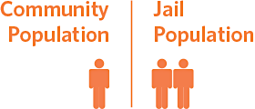
In 26% of jails, the share of Black people in jail is over twice their share of the community.
In 29% of jails, the share of Black people in jail is at least four times their share of the community.

In 16% of jails, the share of Black people in the jail is at least three times their share in the community.
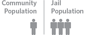
This graphic uses icons of people to visually convey the data, offering a more humanized representation than numerical figures or bar charts alone. A separate box (not shown here) explains some of the structural harms, including segregation and redlining, that have contributed to the effect displayed in the data (Pew Charitable Trusts, May 16, 2023). (See also “Provide context”.)
Disaggregate when possible
Background:
Aggregating data—combining multiple groups—can oversimplify data or make certain groups invisible, leading to potentially biased or misleading analyses and a lack of services or funding for the groups that need it most. Examples of aggregation include lumping together Pacific Islander people with Asian American people, combining all American Indian and Alaska Native people, and grouping genders into only binary male and female groups. An example in which aggregation leads to inaccurate conclusions is when all Asian populations are included in a single group. In US science, technology, engineering, and mathematics (STEM) programs, this aggregation can mean that Southeast Asian people—including Hmong, Vietnamese, Filipino, Laotian, and Cambodian people, among others—are considered part of an overrepresented racial and ethnic group even though STEM fields have historically excluded these subgroups.
Aggregation is particularly problematic when groups are lumped into a category called “Other,” as that label is ostracizing. Alternatives that the Urban Institute's Do No Harm Guide: Applying Equity Awareness in Data Visualization recommends for racial and ethnic categories include “another race,” “additional groups,” “all other self-descriptions,” “people identifying as other or multiple races,” “identity not listed,” and “identity not listed in the survey.”
In contrast, data disaggregation—separating data—can highlight the specific needs of distinct groups. For example, disaggregated data in San Francisco County shows that Samoan youth are overrepresented in San Francisco Juvenile Hall, showing the need for targeted support. The National Congress of American Indians, the Asian and Pacific Islander American Health Forum, the Leadership Conference on Civil and Human Rights, and others have called for data disaggregation as a way to promote equity.
One challenge to data disaggregation is small sample sizes. But instead of omitting these groups altogether, the Urban Institute says in a 2022 article that communicators can present the data with explanations about lower reliability of data or show the group name with empty data.
One of the ways to support data disaggregation is to ensure robust and inclusive data collection practices. For example, people can allow write-in options for people to self-describe their identities and do outreach to ensure sample sizes will be large enough for statistical analysis. These practices should be conducted in collaboration with members of the community whose data are being collected. Collecting more data and for a wider range of groups can help research reflect the lives of all people.
Recommendation:
Disaggregate data when groups experience dissimilar effects, they don’t share a history, or members of the community say analyzing these populations together is unreasonable (Urban Institute, 2022). For example, when discussing data on gender groups, report data on transgender and nonbinary people. Avoid combining data on distinct groups, such as data on Pacific Islander people and Asian American people. When you lack information for specific groups, acknowledge the limitations of the data. Also avoid using an "Other" category. If the use of a category comprising multiple identities is necessary, define the groups included, and use language that is respectful and descriptive rather than simply naming it “Other.” See also “Gender identity options” in “Common questions,” “Not implying that gender is a binary construct,” and “Avoid the term ‘Other.’ ”
Collect data in a way that can support disaggregation. And ensure that people can self-identify in a way that reflects their reality. Whenever possible, consult with community leaders when collecting, analyzing, and reporting data to ensure the data accurately reflect the experiences and needs of the people surveyed and balance privacy concerns with the need for representation. See also “Handling small data samples.”
Example:
Use:
Men continued to make significantly more than people of other genders
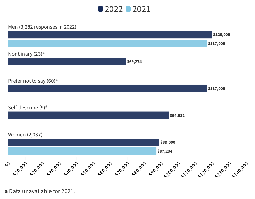
This chart acknowledges more than two gender categories and lists genders in alphabetical order (C&EN, Oct. 17, 2022).
Handling small data samples
Background:
Sometimes communicators omit data from a visualization because the sample sizes are very small. The National Congress of American Indians says American Indian and Alaska Native people can be described as the “asterisk nation” because many data visualizations use an asterisk to note missing or insufficient data on this group. But omitting groups from data is a form of erasure. Abigail Echo-Hawk, former chief research officer of the Seattle Indian Health Board, explains in a 2019 Crosscut article by writer Manola Secaira, “One of the ways that there is a continuing genocide against American Indians/Alaska Natives is through data. When we are invisible in the data, we no longer exist.” Another example of erasure in data is when transgender and/or nonbinary people are not included in data visualizations by gender.
When the sample size for a group of people is small, it is better to acknowledge missing or limited information rather than omitting the category altogether. Heather Krause explains in a 2020 We All Count article, “There is a world of difference between saying ‘we’re less certain’ and ‘they don’t count.’ If you have a small sample size for a certain group, what you can say about them might be less ‘certain’ or ‘reliable’ than you want, but that doesn’t mean we should discount their data with terms like ‘not statistically significant.’ ” Noting missing or limited information acknowledges the absence of those communities and may encourage future inclusion. Using arbitrary rules to declare data "not statistically significant" oppresses smaller groups, disregards useful data, and shifts the responsibility for creating meaningful results onto marginalized populations.
It is difficult to determine an exact threshold for when a group is too small to be broken out separately. “Group size will always, however, be a practical consideration, which should be weighed against the severity of a subgroup’s social and health disadvantage and how different it is from the larger group, based on available information,” says the report Health Equity: Everyone Counts, by the University of California, San Francisco, and Robert Wood Johnson Foundation.
Showing small groups may also raise privacy and confidentiality issues. “Particularly when subgroups are small (e.g., one American Indian Tribal Nation), concerns mount about being able to distinguish identities of individuals included in data collection. . . . The smaller a group, the easier it is to identify an individual, even without having names and addresses,” Health Equity: Everyone Counts says. The Equitable Data Working Group also notes that disaggregated data should not compromise people's privacy.
Small sample sizes can be challenging to work with, but there are ways to maximize the data obtained from them. In a 2015 Prevention Science article, researchers Carlotta Ching Ting Fok, David Henry, and James Allen discuss ways to optimize the data from small samples, including using specific research designs and statistical analysis techniques.
To prevent small sample sizes, data collectors must prioritize proactive outreach to groups that they have historically excluded. This work involves engaging with communities, organizations, and individuals to get more comprehensive and representative data.
Recommendation:
If the sample size for a particular group is very small, avoid omitting the data entirely or noting “not statistically significant” without additional context. Instead, as long as privacy can be maintained, present the data while acknowledging the limitations—for example, explain the level of reliability, and provide measures like confidence intervals and standard deviations. Also, explore data collection and statistical techniques that will give analyses of small groups more reliability.
If presenting data on small groups would compromise people's privacy, an alternative approach is to present all category names in the same chart. Instead of displaying the data for too-small groups, display a message explaining why data cannot be shown. Communicators can also present qualitative data, such as text descriptions, if quantitative data are too unreliable and privacy is an issue. See also "Disaggregate when possible."
To prevent small sample sizes, data collectors should prioritize proactive outreach efforts, including building partnerships with community organizations and experts, using multiple recruitment channels, tailoring collection methods to engage underrepresented communities, and fostering trust and rapport with potential participants.
Examples:
Use:
In the Guardian's interactive article "How Diverse Is the 2018 US Congress?" about the 2018 US midterm elections, the authors used three gender categories: cis male, cis female, and trans and nonbinary. Clicking on the trans and nonbinary category updates an interactive map to display all districts in gray, indicating that "0 people in Congress share this identity." In this case, the absence of data holds as much significance as the information that is actually presented.
Use:
The Do No Harm Guide: Applying Equity Awareness in Data Visualization, by the Urban Institute, cites ProPublica's data tool used in the 2020 article "What Coronavirus Job Losses Reveal about Racism in America” as a good example of acknowledging data limitations. People can use the tool to find the unemployment rates for people of a specific race, gender, age, education, and income. If a particular combination would not have statistical reliability because of a small sample size, the tool displays a message explaining the limitation.
Use:
The C&EN article "What US Chemists Made in 2022" shows data for all identity groups surveyed, even those with low numbers. To ensure readers could make informed choices about how to interpret the data, the article includes the number of respondents for each group and the note “ACS considers data calculated from fewer than 50 responses unreliable. C&EN included small groups to help make all members visible.”
Use:
“Note that at least 5% of respondents in each category either chose not to disclose their racial or ethnic identity or chose the self-describe option. No other racial/ethnic group accounted for more than 6% of any category so it is difficult to make meaningful comparisons of representation across roles for these identity groups” (Diversity Data Report 2022). (In addition to showing all racial and ethnic groups surveyed, regardless of size, the report recognizes that some respondents did not disclose their racial or ethnic identity. It also acknowledges the limitations of the sample sizes and concerns about data reliability.)
Choosing color in data visualizations
Background:
“In data visualization, color sets the tone and enforces a message for the underlying visual display,” contributor Eva Murray writes in a 2019 Forbes article. Poor color choice can distract from content, confuse the meaning, and lead to data manipulation, intentionally or not. One way color can influence people’s interpretation of data is by its associations—such as to certain political parties, brands, cultural traditions, and emotions.
According to a 2020 article published in the Journal of Experimental Psychology, English-speaking participants commonly associate the color red with concepts related to aggression, attraction, or heightened attention (e.g., stop, danger), while darker colors often have negative connotations. Consequently, using these colors to represent people can be problematic, as they may imply danger or negativity. See also “Avoid associating “black” or darkness with bad, and “white” or lightness with good.”
Another consideration is avoiding colors that perpetuate stereotypes. For example, the Urban Institute’s Do No Harm Guide: Applying Equity Awareness in Data Visualization recommends against using pink for women and blue for men—a combination that could reinforce thinking of gender as a binary construct—as well as matching colors to skin tones (like using black to represent Black people).
Beyond the individual colors chosen, communicators should understand how the palette of colors may affect data interpretation. Using shades of a single color, for example, implies degrees along a spectrum, so that approach is better for data on a scale, such as temperature. Shades are less appropriate for categories such as races and ethnicities, according to the Urban Institute. Understanding how combinations of colors can reinforce ideas about hierarchy and differences among social groups can help communicators show data with empathy.
Finally, all color choices should be accessible. For example, adjacent colors that have meaning should have adequate contrast against one another (see also “Color contrast”).
Recommendation:
Avoid choosing colors at random without considering their meaning or cultural associations, especially when the color's job is simply to provide distinction against adjacent content. Recognize when certain colors may perpetuate stereotypes. For example, when representing gender data, consider using a color palette that does not rely on binary associations, as pink and blue do.
Use appropriate color palettes for the type of data being visualized, and prevent introducing distortions in the data. For more information on choosing colors for specific data visualizations, see Lisa Charlotte Muth's articles and NASA's Elegant Figures blog, which go into more detail on the most effective color palettes to represent different types of data. See also “Color to convey meaning” and “Color contrast.”
Ordering groups in data visualizations
Background:
The order of groups in a chart, table, or other visualization can imply a hierarchy or suggest that certain groups are the standard for comparison, which can lead to bias and othering. In “General Principles for Reducing Bias,” the American Psychological Association notes that groups on the left of a graph or the top of a table may be perceived as more socially dominant or suggest that these groups are the standard for comparison. People often think about power in terms of vertical space: powerful individuals or groups are placed above those with less power. In a 2005 study published in the Journal of Personality and Social Psychology, participants were asked to quickly judge pairs of powerful and powerless groups. Participants were faster at identifying the more powerful group when it was placed at the top. A separate 2006 study published in Organizational Behavior and Human Decision Processes found that people mentally represent a leader's power using vertical positions in space. The study revealed that even small differences in spatial elements, such as the leader's office floor level or the height at which their picture is displayed on a wall, can affect how power is perceived. Research has even suggested that voters may be influenced by the order in which candidates' names appear on the ballot. Considering the order and positioning in data visualizations and how they shape perceptions of power can help mitigate biases.
Recommendation:
Carefully think about the order in which groups are presented and how it might imply a hierarchy. Consider starting with the particular group the study is focused on or sorting the groups alphabetically. Interactivity can also be used to allow users to customize the order of presentation. See also “Order information strategically.”
Example:
Use:
All Authors Submitting
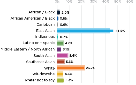
In this example, racial and ethnic categories are listed alphabetically (Diversity Data Report 2022).
Accessibility considerations for data visualizations
Background:
Many visualization tools don’t support accessible design, and those that do can be confusing to learn. Interactive graphics like charts and maps may be inaccessible to people with motor disabilities, especially if they require zooming and navigating a dataset, clicking on data points or hot spots, or interacting with chart menus. Additionally, while it may be relatively easy to translate data describing frequencies of different categories or values from bar charts, pie charts, and line charts, hierarchical and network diagrams are more challenging to make accessible.
Recommendation:
Ensure that interactive visualizations are accessible via keyboard, meaning users are able to navigate and interact with the data points, chart menu, and other chart controls using the keyboard only. Provide a text summary or data export of the visualization, making sure to describe trends or patterns in the visualization. Offer the preprocessed values that can be reasonably inferred from the visualization rather than presenting the raw and unaggregated dataset.
To make it easier to visually distinguish between stacked bars and points, it can be helpful to add a border to reduce any unintentional visual effects that may occur at intersections. In addition, label parts of the graphic directly when possible. If you use a key, order things in the key in the same way that they are ordered in the graphic itself. These strategies can help people associate visual elements with values. See also the “Accessibility" section.
Resources on inclusive data visualizations
- Cesal, Amy. “Writing Alt Text for Data Visualization.” Nightingale, July 23, 2020.
- Dhawka, Priya, Helen Ai He, and Wesley Willett. “We Are the Data: Challenges and Opportunities for Creating Demographically Diverse Anthropographics.” CHI '23: Proc. 2023 CHI Conf. Hum. Factors Comput. Syst. article 807 (April 2023): 1–14. https://doi.org/10.1145/3544548.3581086.
- Krause, Heather. “No One Is an Asterisk." We All Count, Dec. 4, 2020.
- Morais, Luiz, Yvonne Jansen, Nazareno Andrade, and Pierre Dragicevic. “Showing Data About People: A Design Space of Anthropographics.” IEEE Trans. Visualization Comput. Graphics 28 (March 2022): 1661–79. https://doi.ieeecomputersociety.org/10.1109/TVCG.2020.3023013.
- Muth, Lisa Charlotte. Articles.
- Project Inkblot. "How to Begin Designing for Diversity.” The Creative Independent, Sept. 18, 2019.
- Reich, Julia. “Designing with an Awareness of Diversity, Equity and Inclusion (DEI).” Stone Soup Creative, Dec. 29, 2020.
- Schwabish, Jonathan, and Alice Feng. Do No Harm Guide: Applying Equity Awareness in Data Visualization. Washington, DC: Urban Institute, June 9, 2021.
- Urban Institute. The Do No Harm Project.
- Urban Institute. "The Racial Equity in Data Visualization Checklist."
- Winter, Bodo, Sarah E. Duffy, and Jeannette Littlemore. “Power, Gender, and Individual Differences in Spatial Metaphor: The Role of Perceptual Stereotypes and Language Statistics.” Metaphor Symb. 35, no. 3 (2020): 188–205. https://doi.org/10.1080/10926488.2020.1794319.
- Zhou, Li. “The Inadequacy of the Term ‘Asian American.’ ” Vox, May 5, 2021.
;void(0);)
- GET TO KNOW US
- About ACS
- Press Room
- Jobs at ACS
- Governance
- ACS Store
- JOIN US
- Join ACS
- Renew Membership
- Member Benefits
- GET INVOLVED
- Advocate
- Volunteer
- Donate
- ACS Network
1155 Sixteenth Street, NW, Washington, DC 20036, USA | service@acs.org | 1-800-333-9511 (US and Canada) | 614-447-3776 (outside North America)
Copyright © 2024 American Chemical Society